
(Most of) the humanitarian sector is bad at design. Why does that matter?
The majority of digital products, services and systems created by INGO and Humanitarian orgs still fail. They fail to achieve widespread adoption or scalability, create meaningful impact, or demonstrate cost efficiency.
When it comes to deciding why, the blame is usually given to resource and budget constraints, technological limitations in deployment areas and inadequate training and support.
Rarely is the finger pointed at bad design. Yet bad design can be the root cause of failure.
And it’s everywhere in the humanitarian sector.
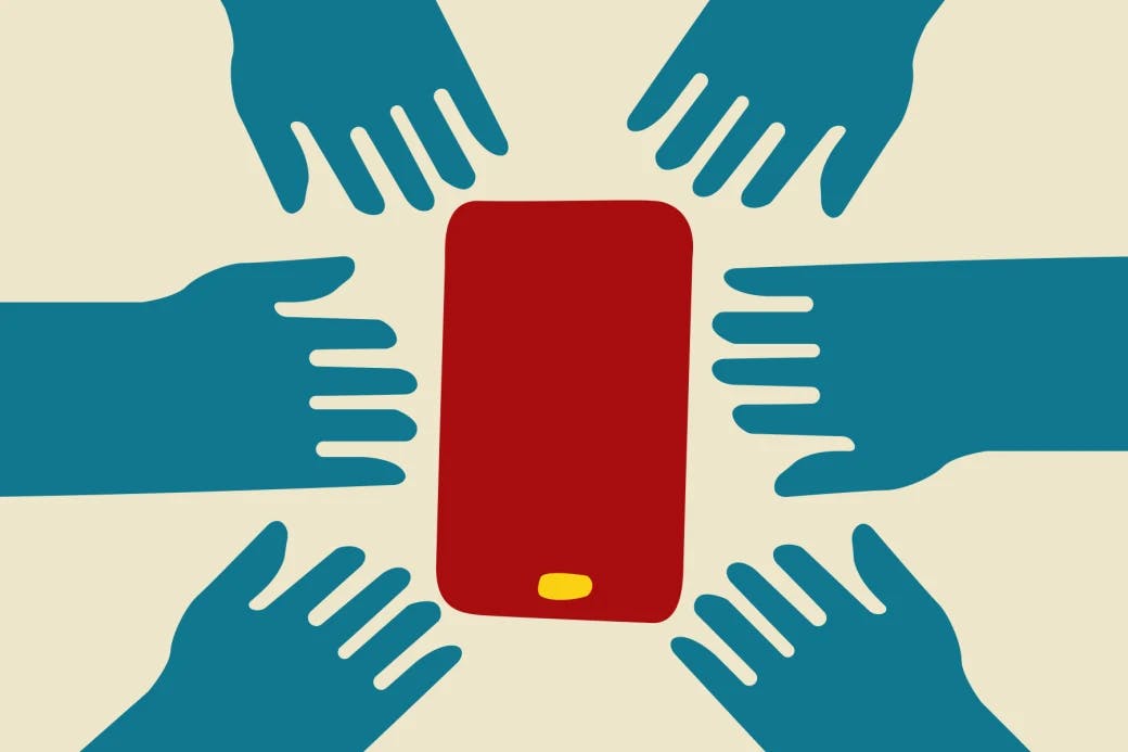
Take a moment to reflect on the apps on your phone or the systems on your laptop that you use daily in your personal life—Uber, Deliveroo, Airbnb, Spotify. Compare them in terms of look and feel to those deployed for vulnerable populations. They are generations apart.
Some common characteristics of badly designed humanitarian-borne products are:
- Cluttered and inconsistent user interfaces that confuse and overwhelm users.
- Complex and un-intuitive navigation that makes simple tasks frustratingly complicated.
- Slow responsiveness that discourages continued use.
- Poor localisation and inadequate accessibility that fails to meet the diverse linguistic, emotional and physical needs of the target audience
- The lack of proper error handling and feedback mechanisms leaves users feeling unsupported and disengaged when they deviate from the ‘happy path’.
- Uninspiring brand and UI (often in grey - which is indecipherable in bright sunlight), offering little to compel users to engage.
And the list goes on.
Consider the reality faced by the end-users. Vulnerable individuals are often stressed and exhausted, with displacement trauma affecting their cognitive abilities to focus and retain information. Yet, they are bombarded with digital products and services that are laden with confusing clutter and complex user experiences.
Good design is still not prioritised by the sector.
It's viewed as a luxury, akin to having an office with a great view or flying business class. When budgets are tightened, design time is usually the first to be cut.
However, good design is not a luxury; it's essential.
Every user is also a person, a person with taste, and standards, and commitments, and distractions; a person who will engage if it's compelling and not if it isn't. The cognitive stuff is true, but there's also just a basic lack of respect in creating something below par for a user. Just because their situation is different to ours, that doesn't mean they'll engage with a badly designed product.
It’s important to acknowledge the humanitarian sector doesn't have the same goliath budgets as Uber, Spotify and co, but good design doesn't need to be expensive. With small budgets it’s imperative to simplify. So many humanitarian borne products try to meet multiple different needs for multiple different user groups. The result is a confusing, complex product that serves nobody well. Instead choose one user and one need and do that brilliantly.
So what does good design for vulnerable people look like? And why is it important?
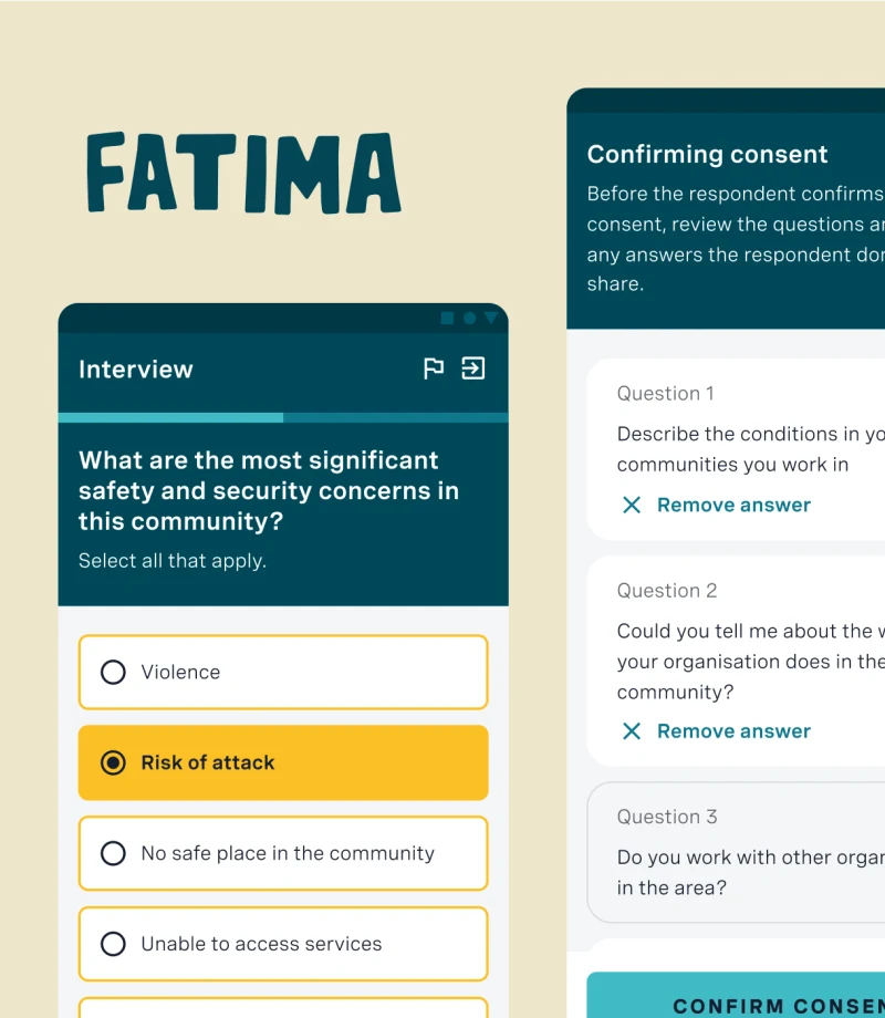
It's simple and intuitive
The design should feature a clean, straightforward layout that is easy to navigate. Icons should be large and clear, text should be readable (using simple language and clear, right-sized fonts), and the overall user flow should be logical and minimalistic to reduce cognitive load.
It is accessible
This includes support for screen readers, subtitles or captions for videos, voice commands, adjustable text sizes, high-contrast colour schemes, and alternative navigation options that cater to a range of physical abilities. Accessibility ensures that everyone, regardless of disability, can use the product effectively.
It’s culturally and linguistically adaptative
The product should be localised for different cultural and linguistic groups, incorporating multiple language options — professionally translated, culturally relevant design elements, and sensitivity to local norms and practices. This makes the product resonate more deeply with users and increases its utility.
It’s adaptable
The design should function well on all devices, from high-end smartphones to basic feature phones, and be adaptable to different screen sizes and orientations. This is especially important in regions where users might not have access to the latest technology.
Finally, it’s visually engaging
Visually engaging design is vital for vulnerable populations as it enhances understanding, engagement, and trust in digital products. It simplifies complex information, making it more accessible, especially for those with lower literacy levels. It can also reduce anxiety and foster a more enjoyable and empowering user experience.
The truth is good design sticks.
Good design is embraced because it’s simple and easy to use, and adds instant, long lasting value to the user’s life. Good design is shared with friends and family. Good design will help to ensure the humanitarian sector creates products and services that vulnerable people love and trust and use to safely progress their lives and the lives of those around them.
Next month Here I Am will be launching a brand new design process. If you would like to be the first to hear about this, get in touch at hello@hereiamstudio.com
Read more
Inspired by this post?
We love to share perspectives, thoughts and ideas on creating digital ways to include the excluded. If you have a problem you'd like to discuss, we'd love to hear from you.